

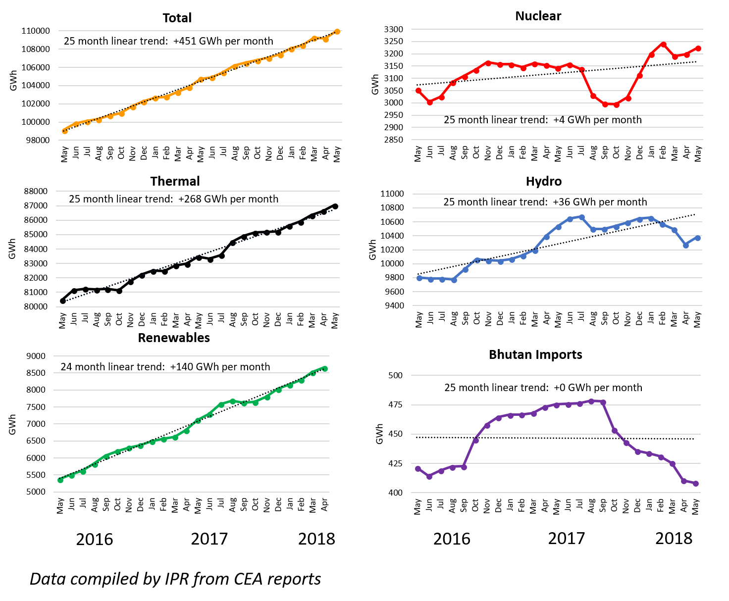
This post introduces the first of two new depictions of electricity generation sources, over two different time-scales. But first, here are the data for the 25 months to May, shown, as before, on a twelve-month moving average basis to control for seasonal influences. (CEA renewable data for May were not available at time of posting so the 24 months to April are shown here). It remains a two-horse race with thermal and renewable generation both continuing their almost linear rates of increase, jointly producing some 90% of India’s grid power. (Please note the different scales used in each graph below). Changes in the other four sources are almost inconsequential by comparison, although hydro showed a small up-tick after recent declines.
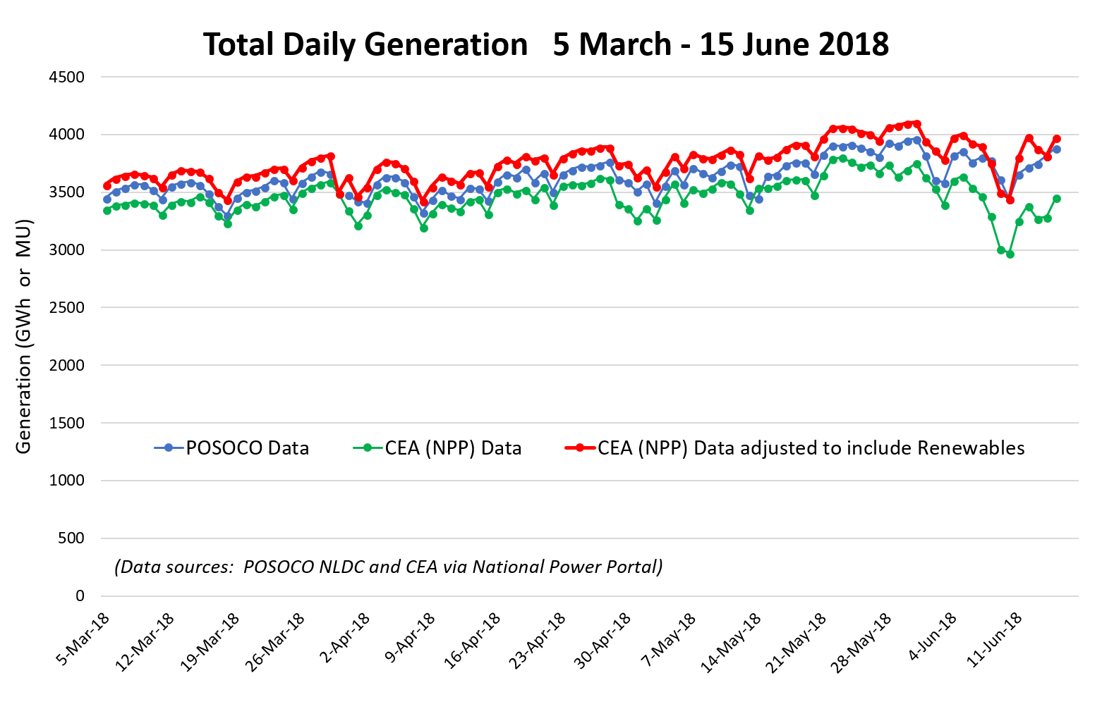
While the ‘big picture’ trends are best seen in the way we’ve been showing them – some interesting shorter term fluctuations are hidden when averaging over many months. For the first time, we are adding two of these shorter term perspectives on generation. First is daily generation data for 2018. This uses a different source, the POSOCO National Load Despatch Centre, which publishes daily reports. These differ slightly from the daily CEA data, now available through the National Power Portal (NPP), including the fact that POSOCO report gas separately from coal and lignite, and include wind, solar and total renewable generation values. A word of caution here, as POSOCO state the disclaimer that they have limited visibility of embedded solar data, provided by the State Load Despatch Centres. Moreover, the renewable data is likely to be quite preliminary – the CEA usually produces its renewable breakdown a month after conventional generation figures.
Nevertheless, the data-sets do follow very similar daily trends, as shown in the graph below for total generation. This includes two patterns – a slow rise in generation across the four months – and a weekly trend normally ending in a Sunday minimum. The similarity of the POSOCO and CEA (NPP) data-sets (blue and green respectively) is apparent – especially when the CEA (NPP) data, which excludes renewables, has them included (from the POSOSCO breakdown), shown in red. Note the increasing discrepancy between POSOCO and unadjusted CEA data for the last 10 or so points in the graph below – this is when the monsoon gave a large boost to wind, which shows up in one data-set but not the other. The reason for the small absolute differences between the two data-sets is not immediately clear. While POSOCO data show slightly higher generation than CEA (NPP), adding renewables to the CEA (NPP) data swaps this order and makes the CEA (NPP) values higher than POSOCO’s. Please let us know if you know the reason for these small but systematic differences.
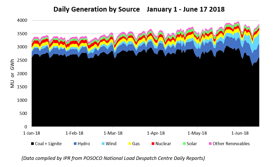
Below we break down the total POSOCO data into its various components, as a ‘stacked’ graph. The dominance of coal is very clear, but the seasonal shift towards increasing wind and hydro with the advent of the monsoon is apparent for the June data, as hinted at above. For example, in mid-May, wind was still producing less than 100 GWh daily, but by mid-June values as high as 467 GWh had been achieved. Comparing the two blue bands on the left edge of the graph (for January 1st) with those at the right edge (for June 17th), the seasonal contributions of hydro and (especially) wind show up very clearly. Although total generation is clearly higher in June than January, there is a small but discernible depression in coal generation once the wind is really blowing and rain starts to replenish the dams.
In the next post, we take the time-scale down even further, and present samples of generation by source across the day.


Be the first to comment