

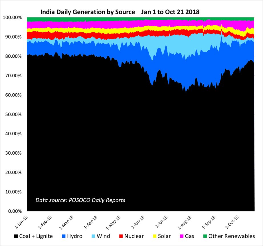
We begin with the most fine-grained data – based on daily generation values – up to October 21. Now the monsoon winds and rain have subsided, the associated wind power surge has ended and hydro power has passed its seasonal peak. Coal-fired generation has gone through its commensurate seasonal low, and is back to the levels last seen in June (in absolute terms), or slightly below (when viewed as a percentage of total generation), as these two figures show:
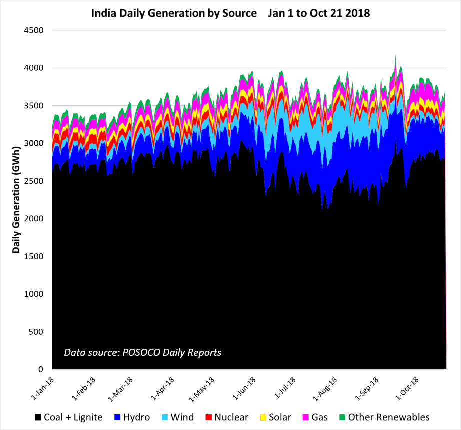
These patterns are as expected, but a noteworthy feature was an uptick in gas generation for several days in early October (shown in pink above and below), which normally makes up about 3% of total generation, to over 5%, or about 200 GWh per day.
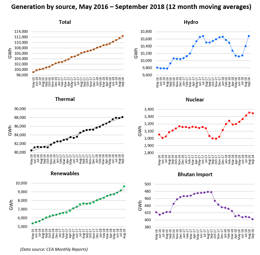
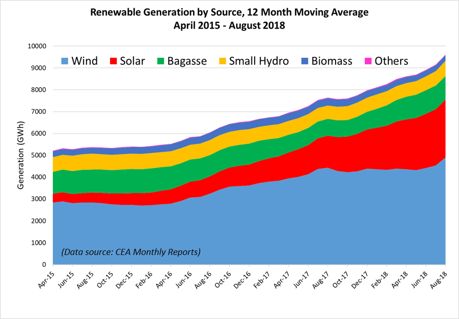
Next we look at the longer term trends, using CEA monthly data up until September (except for renewable data which lags by about one month). In addition to 12-month moving averages which in effect remove the strong seasonal effects, we present individual monthly data points, from June 2015 to the most recent data. (Note: the linear regression values for the moving average data that we previously included have been omitted. They are not particularly valuable for the hydro, nuclear, and Bhutan import data, as these have significant non-linear components. We also discuss trends in a separate post on coal stocks and coal burning for thermal power.)
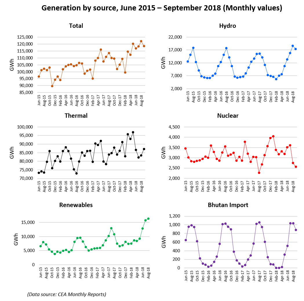
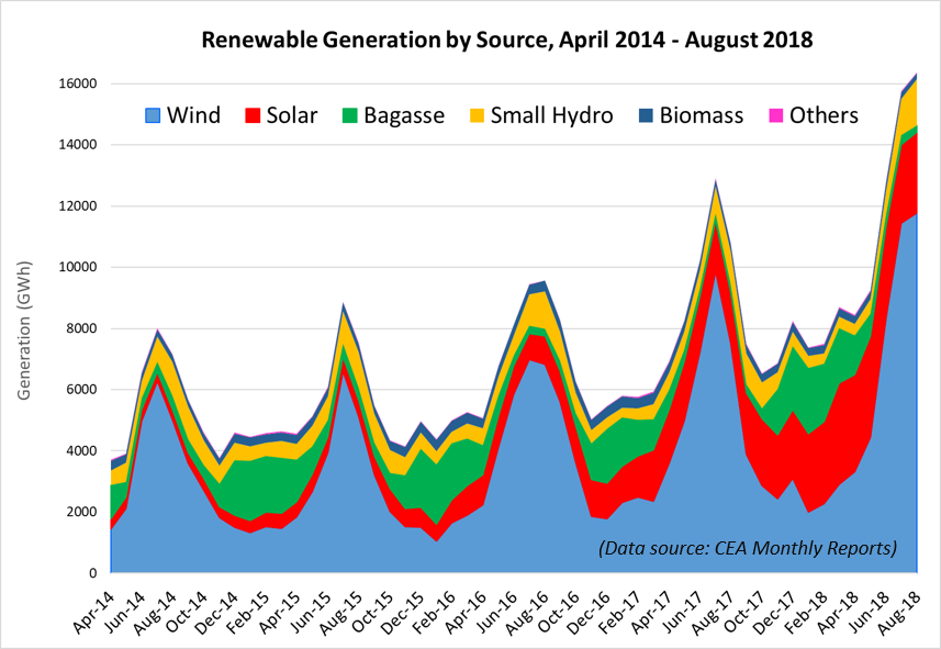
Renewable generation trends showed a continued rise in solar’s contribution. In June, July and August (the most recent month for CEA data), solar produced, respectively, 67, 54 and 59% more energy than in the corresponding months in 2017. Wind power also increased, up 15, 16 and 17% for the same months. Overall, renewables edged up to an all-time high for any 12-month period, to reach 8.6% of total generation. IPR now expects renewables to reach the milestone of 10% of total generation on a 12 month basis, in November or December 2019.
It’s clear that wind and hydro have great seasonal variations, moreover they are in the same phase 🙁
but what about solar seasonal variation? it’s not clear with, it would be good to see solar in separate graph to study it.
Good question, Qui! As you can see in the graph below, the seasonal effects for solar generation tend to be masked by the rapidly increasing solar capacity. This is especially evident for FY 2017-18.
But less capacity has been added in FY2018-19, and you will observe a peak in May. This corresponds to the increased levels of solar insolation, which peaks throughout most of India in that month. See, for example, the red area (high insolation) for May (left-hand column, third row) in the graph below, by Dr. T.V. Ramachandra at IISc Bangalore, whom I had the pleasure of meeting there a couple of years ago. You can view Ramachandra’s original here.