

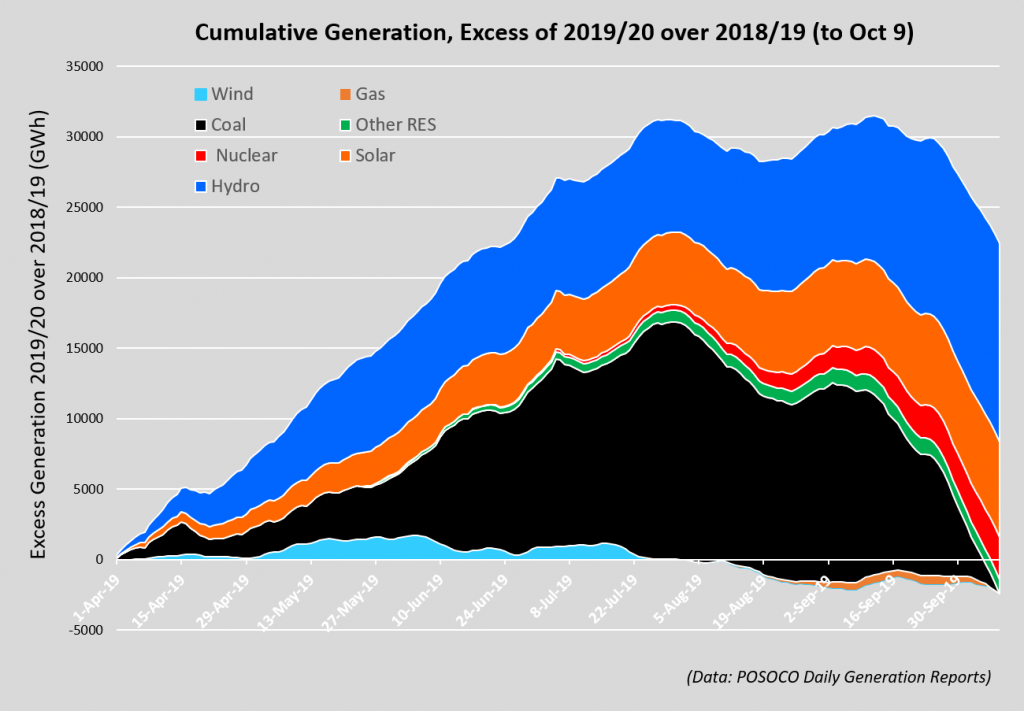
See my piece today in thewire.in for more background. Charts below summarise the story. The first uses CEA data just for coal and lignite (bars) and POSOCO data (cumulative excess). The second (stacked) graph shows the components of this year’s excess generation over last year’s up to Oct 9th, from POSOCO’s daily generation reports.
Bottom line? Coal down, Gas down, Wind down, Nuclear up, Solar up, Other renewables up, Hydro up (a lot), Overall up (though declining).

Be the first to comment